Visualizing Your Journey with Map Connections
See the routes between your trips and discover patterns in how you move through the world

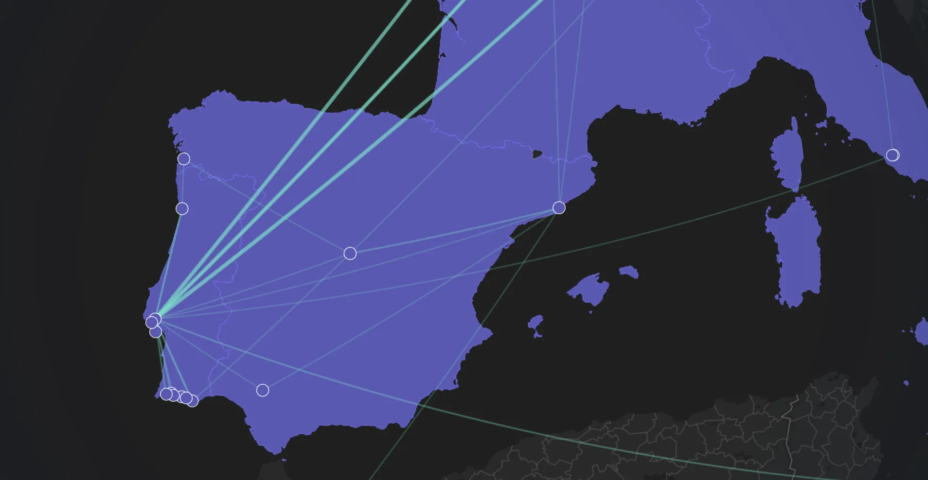
Your travel map now shows the connections between your trips, helping you see the routes you’ve taken and the paths you travel most frequently.
Connection lines appear between consecutive trips in your timeline, creating a visual thread that ties your journey together. The feature reveals patterns you might not notice in a list view, like frequent routes between cities or clusters of nearby destinations.
How Connections Are Created
Connections follow your actual travel chronology. We draw a line between two trips only if they occur within two days of each other in your timeline. This means if you end a trip in Paris on Friday and start your next trip in London on Saturday, you’ll see a connection line between them, as we assume from your input that you traveled from Paris to London.
The two-day window keeps your map clean and meaningful. If you take a break between travels or skip recording a trip, we don’t draw connections across those gaps. This prevents misleading lines that would suggest routes you didn’t actually take.
Connections are bidirectional. Whether you traveled from Berlin to Amsterdam or Amsterdam to Berlin, the system treats these as the same route and counts them together. This approach surfaces your most frequent paths regardless of direction.
Visual Frequency Indicators
Lines vary in thickness and opacity based on how often you’ve traveled each route. A thick, prominent line indicates a route you’ve taken multiple times, while thinner, more subtle lines represent one-time journeys.
When you hover over a connection, you’ll see a tooltip showing the cities it connects and how many times you’ve traveled between them.
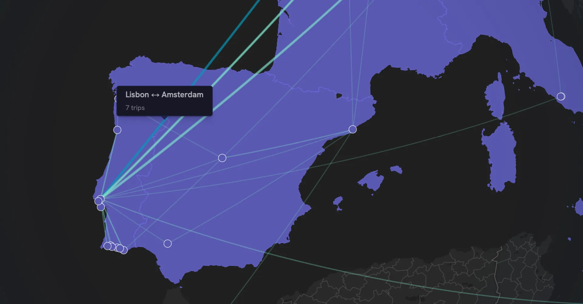
This visual weighting helps patterns emerge naturally. You might notice that you frequently shuttle between two cities, or that certain destinations serve as hubs connecting multiple other places in your network.
Keeping Your Map Accurate
The quality of your connections depends on keeping your trip timeline complete. Missing trips create gaps in the visualization, just like they affect your distance statistics.
When you add trips that connect previously separate segments of your timeline, the map updates to reflect the new connections. If you realize you forgot to log a layover or side trip, adding it later fills in the gaps and completes the picture.
The connection rules work alongside our existing distance calculations. Both features use your trip coordinates and timeline order, so maintaining accurate trip records improves both visualizations simultaneously.
Future Enhancements
We’re exploring ways to make connections even more insightful, like filtering by date range to see how your travel patterns change over time, or grouping connections by transport mode to visualize how you prefer to travel different routes.
Have ideas for how connections could better tell your travel story? We’d love to hear from you via email or on X.